Best for
Memorial rings, wedding bands, family symbols, outdoor scenes, names, dates, and meaningful gift rings.
A good custom engraved ring is not just a picture wrapped around a band. It is a small piece of art that has to survive scale, curvature, lighting, and daily wear.
Memorial rings, wedding bands, family symbols, outdoor scenes, names, dates, and meaningful gift rings.
Readable silhouettes, clean negative space, and a clear priority detail instead of every possible detail at once.
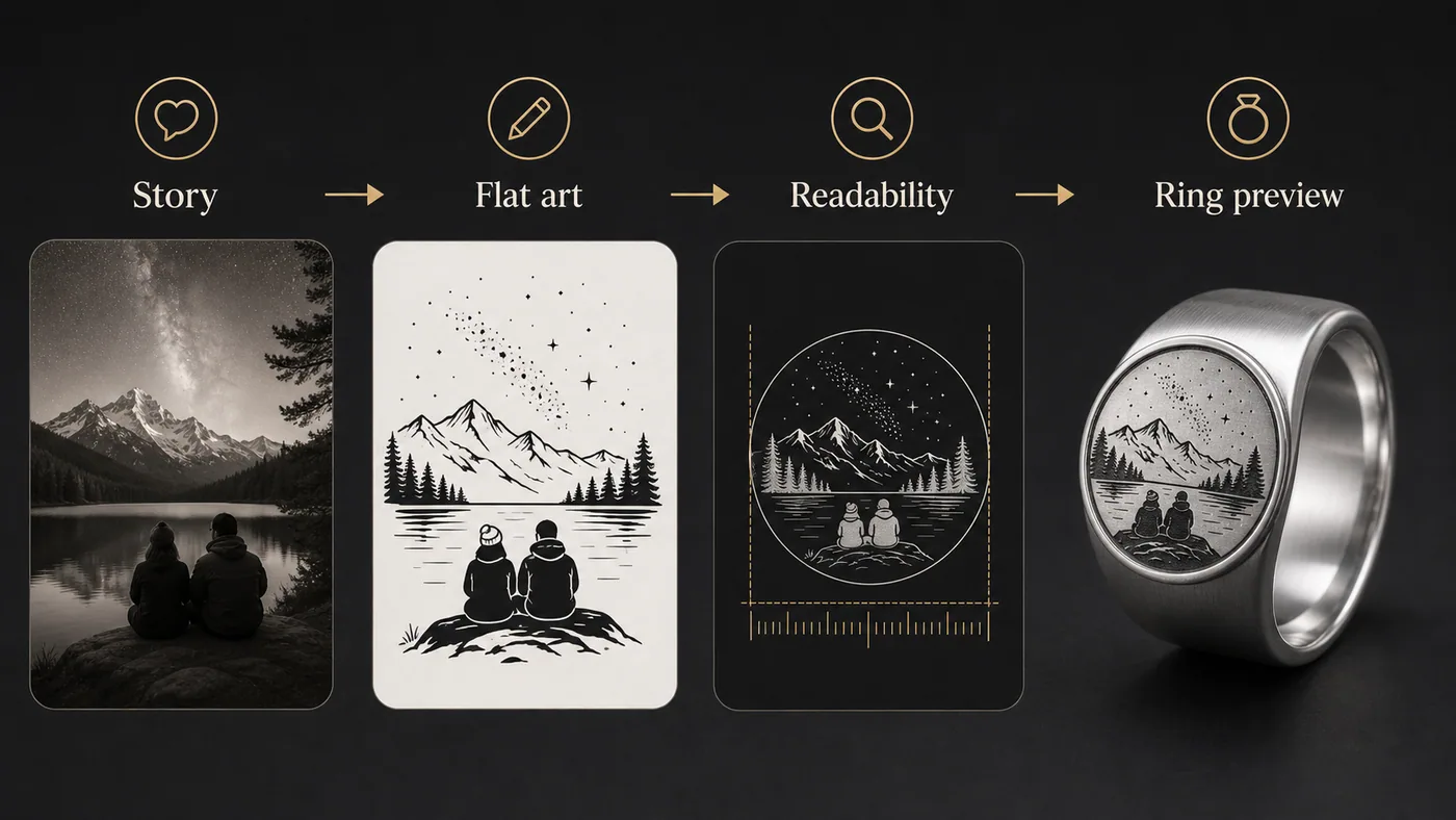
The designer starts with flat black-and-white engraving art, then creates a silver-tone ring preview after the artwork direction is usable.
Ring engraving is a compression problem. A full story has to become a few readable marks that still feel personal when they are wrapped around a curved band. The strongest designs usually choose one main subject, one supporting detail, and one quiet area where the eye can rest.
For example, a mountain proposal ring does not need every tree from the trail. It may need the peak shape, a horizon line, a date on the inside, and enough open sky so the scene does not turn into texture. A memorial ring may need a name, a flower outline, and a small symbol rather than a portrait with too many facial details.
Bring the memory in plain language: who the ring is for, what the moment means, and which detail must not be lost. If there is a date, phrase, nickname, place, or symbol that matters, write it exactly. If the idea includes a profession, hobby, or pet, name the object or scene that would make the ring instantly recognizable to that person.
Short prompts often make generic rings. Better prompts give the AI a hierarchy: main symbol first, mood second, background details last. A useful prompt might say, "silver-tone engraved band for my dad, firefighter helmet as the main symbol, subtle smoke lines, badge number 27 inside, serious and realistic, no cartoon style."
The flat artwork matters more than the shiny mockup. The mockup helps you imagine the ring, but the flat black-and-white preview is where readability problems show up. Look for thin hairlines, tiny lettering, crowded corners, mirrored duplicate scenes, or shapes that only make sense at full screen.
If the flat art looks busy, revise the idea before checkout. A simpler design usually feels more expensive because the engraving has confidence. The goal is not to use every inch of metal. The goal is to make the important part impossible to miss.
Yes. Start with a plain-language prompt. The designer helps turn the idea into flat artwork before showing the ring mockup.
Yes, but short text reads better. Use exact spelling and keep important text separated from dense artwork.
The public checkout currently defaults to silver-tone tungsten. Future materials need explicit price mapping before public checkout.
Watch on page
Watch the design walkthrough before you spend credits or checkout.